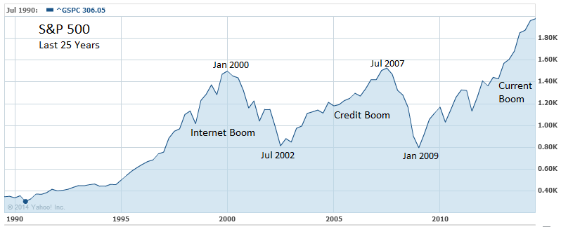
As we approach the milestone 2,000 level on the S&P 500, it dawned on me that we have nearly tripled the value of the index since its last bottom in early 2009. It had been some time since I had visualized the broad-based equity index. Doing so in the chart above reflects the spectacular stock market boom we have been experiencing for over five years.
How long will this boom last? More interestingly, what will it be named?


